Icecream parlor (comments)
Displaying 21 - 37 of 37 comments

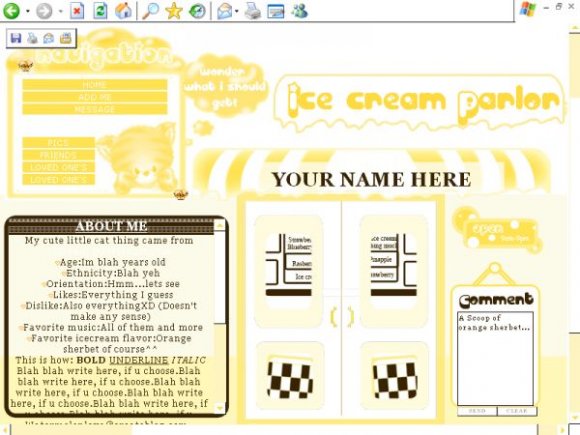
I think colors such as salmony pink, teal, ocean green, and any of those types of colors would have looked better.

Yeah, It could have been amped up moreXD But it's too late for that now, so I gotta think of something elseXP
But not now, I have school work due tommorowT__T Wow I procrastinate too muchXD
These layouts work on myspace...of courseXD

Obviously a GREAT idea! Especially for the summer time. I just think it could have been amped up a bit. More color, an ice cream stack. Maybe a 50'a-esque vibe going on. Who knows, love it though!

U know, I didn't think of it that way>.< I was just thinking or Orange sherbert colors, but I guess If the header is Icecream parlor, then u would think of other colors...Man I feel kinda slowXD i'm gonna have to try that, and see what happens=D


This is a really cute idea, but the colors are way too monotone.
The name "Ice cream parlor" connotes pastel ice-cream colors, so I think you should have added those kinds of colors to the graphic. I don't understand why you chose to use just yellow and brown? It doesn't make sense to me. =/

When u guys tell me it isn't centered, do u mean it's too far to the left or right???@__@
The purpose for making the doors with the top was supposed to be for the about me section...but when i lowered the opacity of the doors, it looked kinda dull, so I just left it like it was. I tried making the colors equal half and half, cuz I didn't want it to be just yellowT__T but I guess the brown kinda took overXD
Thanks for the advice though, I'll consider it on others^^

um... it isn't centered... and the brown box looks soo out of place compared to the rest of the yellow layout...
u could of just removed the brown box, lower the opacity of the door's graphics and used the double door as a about me section, because it looks soo empty with the comment box on the right and the about me section in the brown box to the left
It isn't centered on my computer. I love the layout tho, very nice!
Thanks everyone, I just hope that I can make more layouts that turn out goodXD I don't know what to say about the contact box thingy thoughT__T
Oh, and I know I'm fantastic *j/k* XD


this is so cute. i swear you amaze me everytime. its official you're now my favorite designer. thislike the 4th or 5th layout i used from u. thanks ;)
Add Comment
You must be logged in to comment
Layout Details
| Designer |
Watermelonlove
|
| Submitted on | Jun 17, 2007 |
| Page views | 49612 |
| Favorites | 338 |
| Comments | 37 |
| Reviewer |
mzkandi
|
| Approved on | Jun 18, 2007 |