Designer's Comments
Look carefully for specific instructions
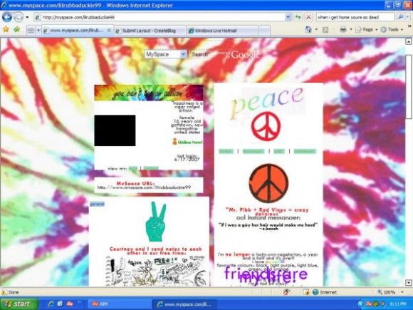
also some stuff like that peace peace stuff wont be in there.
Using This Layout
For specific instructions read designer's comments
- 1. Log into myspace.com
- 2. Click on Edit Profile (Profile 1.0)
- 3. Copy (ctrl c) and paste (ctrl v) code to the specified fields
Layout Comments
Showing latest 10 of 11 comments

I agree with the others that the separation of the background tie dye boxes is destroying the appeal of the layout. Also, like others have said: the tie dye is just "blurry"...hard on the eyes because of it. The makeup of this just seems "off" but it's a GREAT, original concept. A LOT of layouts on here look perfect to the eye yet have no originality in my mind, so kudos to you for having your own ideas.

You should try "stretching" the background so that it doesn't have such obvious seperate lines... but that's just my opinion.

yeahh it needs some work the little peach signs & stuff didnt show up.. and i dont like how small the font is. D=
but its still cutee.
extremely cute.

i hate tie dye, but you idd a nice job with the layout

this is a pretty gd bk ground but i agree with blagheartedstar u may wanna either add the remove friend box code or resize it?? mayb put a marque there or somthing?

wow. I mean its a good concept, but it was not completed correctly. maybe if the boxes were sized to where they were all the same size.
Good job on the background though, but I think the tye dye name is a bit too much.

weird... i have nothing good to say... but u might want to add the remove friends codes to keep the layouts thinness...

Sorry. I don't wanna say "hate," but um .. I strongly dislike this layout. Though I'm sure some people will want to use this layout, I just can't find anything pleasant in it at all. And the background is wayy too blurry/pixely.
[Okay. I know cB has eased its standards (I read the thread), but I honestly think this has passed that limit ..]

this is hot... awesome job
Layout Details
| Designer |
the_hug_monster
|
| Submitted on | Jun 17, 2007 |
| Page views | 53,148 |
| Favorites | 118 |
| Comments | 11 |
| Reviewer |
mzkandi
|
| Approved on | Jun 18, 2007 |