Like Magic (Harry Potter) (comments)
Displaying 1 - 20 of 21 comments


this one is awesome!! i loove HP!! when are you going to make more HP lyts?????????????? lol no rush though♥
thanks♥


Hey I really like this layout but I want to use it for my Quizilla homepage. The only problem is the Friend ID thing. How can I switch it to put a CBox in instead? Please respond here or on my Quizilla account (chrissybaby2). Thanks!
hi!
it is a great layout
but my problem is that my freinds cannot add comments becuase it doesnt have the friend ID on the comment box.
but i checked all of the codes and all the things that say FRIENDIDHERE are filled out.
so, whats wrong??
i tried to make the first section on the left side my music playlist which is one of those project playlists things, and it didnt show..then i tried to make the trailer for harry potter 5 in the small box at the top right...neither is showing up...what am i doin wrong? If you wanna, my page my myspace.com/sirk7, if you wanna add me, or message me that would be really cool...i love this layout, i wish i knew how to make it work! X_X


Verry cool. but my friend used it and the comment box and the links dont show up. do you know why? howp you dont mind


Err... Thanks for the feedback. :)
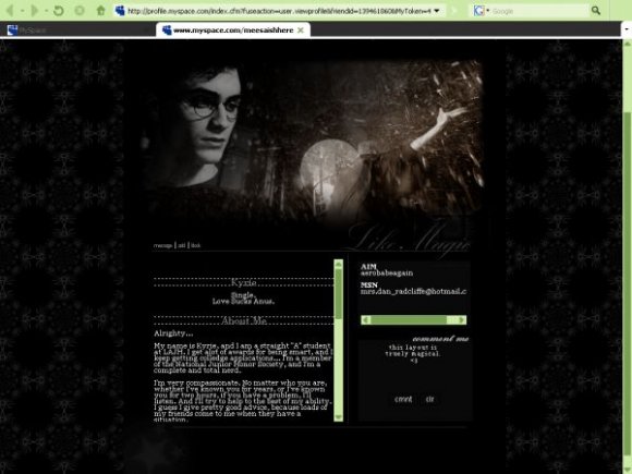
I'm actually surprised that nobody mentioned the star in the corner. After looking at it a little, I thought it was a bit out-of-place.


I can see the Like Magic thing perfectly...
Nice layout.
Gotta love it.
Nice Layout .... Can't Wait For To See The Movie..

I can see the font perfectly fine. It must be your computers!
Squee! Harry Potter! -droolz- I love Daniel Radcliffe. You've just made my day!

i agree with above the like magic font is a bit too faint and the text and link fonts don't seem to go well with the layout
i love hp and i can't wait for the movie but u might want to keep it down on the borders for the headers
instead of double borders just try border-bottom and dotted in a dark grey or brown will go much better then the bright white you have for it
also since ur "like magic" font is cursive u might want to change the font from times new roman to something like verdana or tahoma 8pt - 10pt

this is a really cool layout, the only thing that buggs me is that the place where it says "Like Magic" is so so faint that you cant really see it, and if I was looking at it without seeing the title of the layout I might not notice it. Other than that, it's a really cool layout!
Add Comment
You must be logged in to comment
Layout Details
| Designer |
randomchicka1994
|
| Submitted on | Jun 16, 2007 |
| Page views | 24267 |
| Favorites | 103 |
| Comments | 21 |
| Reviewer |
mzkandi
|
| Approved on | Jun 17, 2007 |