music (comments)
Displaying 1 - 12 of 12 comments


How come all the pictures that were in my comment section are shrunk and screwed up?

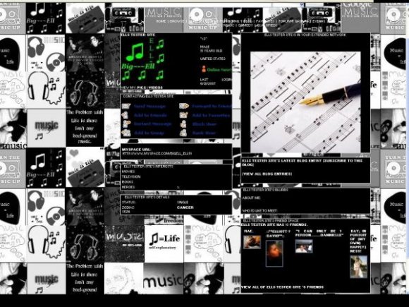
I understand a lot of people like these layouts, and I think it is a good idea, but most of the icons are blurred or pixelated. The banner's picture is beautiful though.
my favorite part is the background. i love all the value you put into it.


I love this too, I'd just like to figure out how to at least make the navigation bar more visible. Maybe make it yellow or something.

I like the background...
But the banner doesn't fit the box and you could see the watermark thing on it. :-/

i like the background, my only complaint is u cant really see the navigation but i luv it anyway. thans

Not a real big fan of the background, but I like the banner. :)
Add Comment
You must be logged in to comment
Layout Details
| Designer |
bigell91
|
| Submitted on | Jun 12, 2007 |
| Page views | 91118 |
| Favorites | 443 |
| Comments | 12 |
| Reviewer |
brownsugar
|
| Approved on | Jun 12, 2007 |