Kandi Guitar (comments)
Displaying 21 - 40 of 57 comments

hello. i love this layout. but i cant seem to get my "view oics" button to work. do you know why this is?

ajay91, go to your myspace home page, and click on the link under your default photo titled "profile"
it will take you to your page. when it loads, look in your address bar. it will give you a link that looks like:
http://profile.myspace. com/index.cfm?fuseaction=user. viewprofile&friendid=XXXXXX
the XXXXXXX will be your friend ID. it's a number, and it comes directly after &friendID=
jennydunn, that is showing because you still have a video saved to your profile, and videos are connected to the comments. That's why it's showing in your comment DIV. If you remove the video, I think that will disappear.
Okay so now theres another one! I give up You get the point though lol.
i PMed you with what part to delete. I can't post code in these comments.
also how can i delete the blog section without erasing the comment box (b/c i figured i erased the comment box while trying to erase the blog section)
newyorkchic08, you're replacing the wrong URL if your background is disappearing. Try pasting the code into a text editing program like Notepad, and go to Edit > Find. Then copy and paste the URL I tell you to look for next to Find what:
Then you'll be sure you're replacing the right one.
And if your comment box isn't showing, you deleted a part of the code.
PM me if you want me to fix that part for you, or you can just compare your code to the code on here.
I cant seem to get rid of the cat picture (whenever I change the first url in the who i'd like to meet section the animation in the background disappears) and my comment box disappeared
Toni, please PM me with your Who I'd Like to Meet codes. I already fixed frostie's for her via PM.
I love this layout! But I have the same problem has frostiebaby456. Only the word "Comment" shows up and not the comment box. How come? Is it because I have my comments showing? And how do I get the comment box to show?

I love this, it's so cool! =D Only thing is, I don't have the comment box on the right, just the title "Comment" so it kinda looks a bit stupid... could you help? Thanks =]
I PMed you silverpennies. I can't message you on myspace because you're only 14.

I really do love it, but is there anyway I can change the scary cat?
www.myspace.com/nicole ycrap
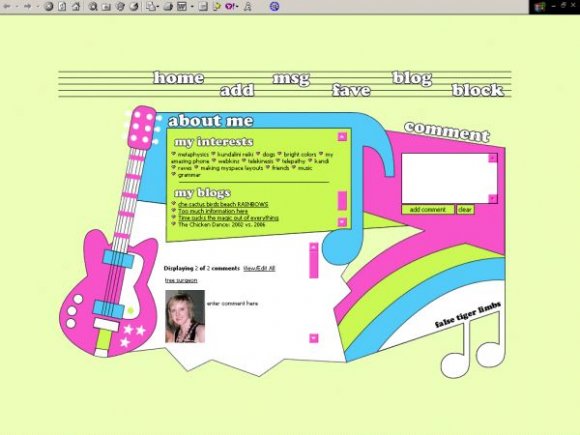
falsetigerlimbs, the consistency in your work is so great to see; each layout is obviously different from the previous but the vector like, almost cartoonish (I don't know much about vectors, so apologies if this is a redundant statement) appearance of each is clearly your style and I love it.
What gets me more though is the way you integrate all the elements so well. So many people, even some of the really experienced designers on here, don't set it up nearly as well as you do. I think you just use shapes and colours really well, and that is almost always my favourite part of your layouts.
This one is no different. I like the solid colours you go for, no attempt to really make the colours match other than for them to have the same blocky feel. That guitar was so well drawn, excellent execution.
I think one thing you could do, is maybe have a colour fill on rollover, for the navigation? That'd look really neat. But great work nonetheless.
Ok, the alternate version is now done, so if anyone wants this layout with their comments hidden, and a blank space there, please PM me for it.
I have yet to code the alternate version of this, but I'll PM you the code when I have. It should be within the next day or two. ;)
Add Comment
You must be logged in to comment
Layout Details
| Designer |
falsetigerlimbs
|
| Submitted on | Jun 5, 2007 |
| Page views | 79145 |
| Favorites | 412 |
| Comments | 57 |
| Reviewer |
mzkandi
|
| Approved on | Jun 5, 2007 |