Designer's Comments
Look carefully for specific instructions
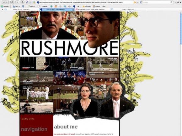
Using This Layout
For specific instructions read designer's comments
- This is a div overlay layout, html knowledge required!
- 1. Log into myspace.com
- 2. Click on Edit Profile (Profile 1.0)
- 3. Copy (ctrl c) and paste (ctrl v) code to the specified fields
Layout Comments
Showing latest 9 of 9 comments

you should make one for the royal tenenbaums

It's blocking up the blood...a napkin or something. He got punched in the nose.

I like this one. good job.

I think what everyone means is the huge white spot around his nose. Is that intended to be there?
What's messed up about his nose? He got punched in the face. It's one of the best scenes in the movie. And, he's turning his head to the back of him, so you can't really see his neck...
Also, if I had taken out the part within his glasses, you probably wouldn't see his glasses.

LOVE THIS MOVIE! Layout looks pretty terrific.

This is really neat; I like the set up, very straight forward. The header is potentially way too big but I like the images you chose - very cleanly done. I don't like the guy with the glasses; like SinfullySweet said, his nose messes it up, though it would have been cool if you'd have taken out the black part on the left side of his glasses and show the image behind that, and also, included his neck, if you HAD to put him in.
I agree with mark. The guy with the glasses's (wow horrible english) nose is a little messed up though.

Wow. This layout looks pretty cool. The only things that bothers me are the header text, like the larger grey text that say "navigation" and "about me." But other than that, I like it. :]