ROCKLEE. (comments)
Displaying 1 - 14 of 14 comments


I like how this looks! ^^.Although the color could be alittle darker.

I dont know why but look at this random scrollbar
Heres The Link :
http://item.slide.com/r/1/1 23/i/aHt4BC9pxD_6jQQa2AexDfWkx XXah1y0/
I would appreciate a fix, I'm currently using firefox

Good layout, problem with the comment link, easy fix though...
I used this for my lil bro's myspace.
Also, I made a picture to use as a sectional for it.
http://img170.imageshac k.us/img170/8919/swordqi2.jpg
Feel free to use it.
Also, if you wanna see the myspace i used it on.
www.myspace.com/joshkum ler

i like it..
i just wish the navigation wasnt centered for some reason..
i think it would look better

i love how you set this nigger up
and the image is awesome
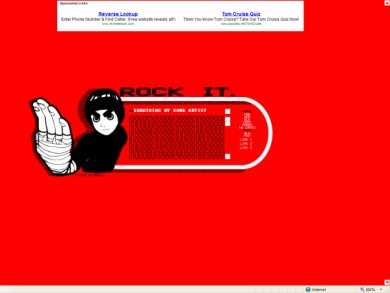
Yeah, this is extremely red. I think Rock Lee should perhaps be centered, but otherwise it's not bad.
for some reason, the comment button link doesnt work on my myspace.
do you know why?

I like it. But the bright, bright red kinda hurts my eyes. >

nice style but the links under the layout need to go and the nav should of been image mapped... with home, add, mail, block, blog and pictures... u have toooo many links... and the link font doesn't seem to go well with the layout
something more in the lines of arial or verdana

Add Comment
You must be logged in to comment