Spongebob Squarepants (comments)
Displaying 1 - 18 of 18 comments

This is adorable.
It's really bright and colorful too. :D
I love Spongebob. Great job.

wow VERY awesome, i love youe color choices, it totally fits [:


this is rather interesting. its great! great choice in colors, and the background you chose is nice!

This is very cool. I really like cartoon themed layouts. XD

it's SUPER cute! You really did a great job making the picture fit into the layout. I know I have trouble with that; usually you can tell where the image stops and the actual layout begins.
I have one problem though; why is the blog so much wider? It's kind of a pain in the butt when text boxes have long horizantal scrollbars.

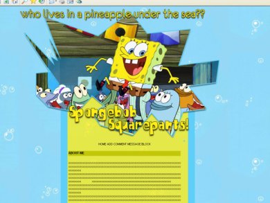
Does he live in a pineapple under the sea? Funny! In my country he lives just under the sea: "Who lives under the sea some place. Spongebob Squarepants" (Hvem bor under sjoen et sted. Svampbob Firkant) But the English/American way is a lot more funnier. LOL!
Like z3nn1, I like how the image stands out from the layout ;) Supah!

i love this layout, a lot! its simple, and just right down the the point.
the bubble background, i love it.


I do agree with z3nn1. In my opinion, you should make the hover font the same as the normal hyperlink font and just have the hover a different color. btw, this is cute :)


I like the image and the way it stands out from the layout, but I wished the navigation was more creative.. I don't think its a great idea used for making them stick out when the mouse hovers on it.. cause it messes with the stuff a user would write up about themselves and such.. but that's my opinion..

Add Comment
You must be logged in to comment