Grunge (comments)
Displaying 21 - 26 of 26 comments

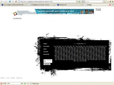
First of all, I looove your avatar. The layout looks pretty good, and simple. I agree with Toya about centering it though. But other than that, Nice job.
Posted by arcanum on May 17, 07 1:23 am


Maybe it would look better centerd as well? For me a black background appears instead of white. Otherwise its ok.
Posted by freeflow on May 17, 07 12:50 am

Really really plain, but I know that's just your intention.I love the small, uppercase nav font though.
Posted by markmejia on May 17, 07 12:43 am

Yeah I had to fix the coding, messed up a couple times in the process :PThanks anyways.
Posted by Lock&Load on May 16, 07 11:01 pm

« Prev ·
Page 2 of 2
Add Comment
You must be logged in to comment