Grunge (comments)
Displaying 1 - 20 of 26 comments


Hi. I'm actually trying to add a slide show where the text is supposed to be. I put the code in there but it doesn't show. What can I do to make the slideshow viewable?
where do i out my firend id for add, message, blog, ext???
there is no FREINDIDHERE spot.
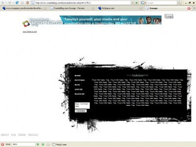
hello I love this layout but I cannot get any of the comment or add or message to work
i really like this layout but i cant get my comment box to work? how do i fix it?
how do you get the song to show up, and great layout.
dudee can u help with the comment boxxx it doesnt work and i put my friendid there too

this is a nice layout, i'm actually going to use it (with credit to you!)but I have two questions.how do I make the text area bg whiteand how do i make the music player show in the upper corner.i was trying to fix it myselfbut all things I would n

i was going to use it because it's nice clean, simple, and plain but then i figures it's a little too simple.I needed a bit more space to spread things out a bit. But overall it's nice and I will probably use when I'm in the mood to wrtie
Yes, it is a little too plain and the navi is really nicebut overall, good job

QUOTE(The Markster @ May 17 2007, 12:43 AM) [snapback]2562575[/snapback]Really really plain, but I know that's just your intention.I love the small, uppercase nav font though. i agree. The border of the div is really cool as well

Centering I think would be a good move to choose.Also I don't really see anything to special about it. I love the simplicity but it just looks like you put a few box brushes together and saved it and thats it.
This reminds me of the Monsters Under The Bed layout but Nikita. I'm not a fan of simple layouts, though I do like the grunge border of this. I'm not a fan of the comment box; it looks too defaultish and...kind of dull and awkward. I don't lik

I like the simple concept of the brush and the having text on top and it being all minimalistic. I just think it would look better if it were centered instead of on the bottom right hand corner because there's a side scrollbar.

yeah the brushes look blurry... but it would llook better centered
Add Comment
You must be logged in to comment