Ashlee Simpson (comments)
Displaying 1 - 18 of 18 comments

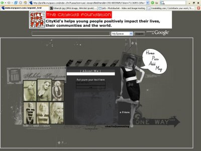
i really like the concept of this. i'm not a big fan of ashlee, but this layout is great stuff.

This one inspired me, although she's a freakin idiot for turning into a Jessica clone


i really like the creativity of the brushes and psd's and i like the placement of everything very well. however, i think the main font should be georgia, like in the header. and the friend's list should be larger.

well hey i like the layouts...but like i was thinking if u could do an adriana lima myspace layout....if u do one i will apreciate it please...

i was gonna say take out the borderbut turns out u didgj :] i dont like ashlee simpson but the layout makes me like her a bit xD

Hmm I think this one looks neat. The friends I think should have a little bigger place for their little links. Maybe going across the top of the about me instead of in that small place and so they don't move so fast that the person can't catch the
i love this!The only thing that erks me is that the television on her face is covering it up a little too much But I look forward to more designs from you!


thanks guys it was my first layout, and i am officialy oamazings new partner so i was like influced bu her as my layouts kidner have to look similar.. so thanks and if you go to www.myspace.com/charlichimoemo u can see the layout in action

The marquee for the friends names is a bit.. fast, and I also agree about the sepia images being somewhat out of place.I wish there was some text typed in, where the about me is. So I could get more of an idea of what it would look like...But the image is

i like it a lot. The nav remoinds me of O Amazing's style but you did a good job

sepia images look out of place, but the layouts nicealthough the content can be centered instead of off to the left
Add Comment
You must be logged in to comment
Layout Details
| Designer |
uprising_designs
|
| Submitted on | May 15, 2007 |
| Page views | 34467 |
| Favorites | 29 |
| Comments | 18 |
| Reviewer |
uprising_designs
|
| Approved on | Dec 31, 1969 |