RandomNess (comments)
Displaying 21 - 36 of 36 comments

im having trouble getting this layout to work. im replacing all five xxxxxx things with my url and when i view my profile it doesnt show anything other that what it shows when i click to preview the layout here. if anyone could help me out that would be awesome. email: racsooscar9@yahoo.com


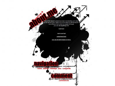
i like this one a lot..i just dislike the arrows seperating the sections for some reason..

Just if you want my opinion :This layout doesn't really appeal to me at all. The huge Impact-looking font looks amateurish, let alone the huge dark shadow under the "navigation" text. I also don't really like the grunged-out arrows, espe


Its was the cb image hosting , the original quality is much higher than that. this is how the original quality should of been. http://profile.myspace.com/index.cfm?fusea...iendid=40049467

HOLLYS BACK?!!! i don't really like this one. The font is too big and the navigation is bulky. Also the images are really low quality for me. I like the main design of it though

QUOTE(Intercourse. @ May 10 2007, 4:47 PM) [snapback]2555785[/snapback]Its nice. Its a nice collage of brushes and blending together and stuff. I think the red is just to blood shot though. Sticks out to much and I don't know I don't thin
I like this; it's very simple but very aeshetically pleasing from the off which is a good intro point. I like the brushes, grungey and random (pretty much like boys LOL). I like the minimalist color scheme too; very in your face and statement making.

I think a different font should've been used for the headers, but this is cool.

Its nice. Its a nice collage of brushes and blending together and stuff. I think the red is just to blood shot though. Sticks out to much and I don't know I don't think red is a really great color to my eyes. I'm really in to nice soft calm co
Add Comment
You must be logged in to comment
Layout Details
| Designer |
IBangBaby
|
| Submitted on | May 9, 2007 |
| Page views | 146742 |
| Favorites | 545 |
| Comments | 36 |
| Reviewer |
JimmyCrackCorn
|
| Approved on | Dec 31, 1969 |