Panda Love (comments)
Displaying 1 - 20 of 21 comments


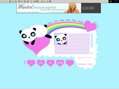
mm, that kind of blue is a bit annoying for my eyes, but i love the way you constructed it.


love this layout so much, id prefer a bunny, but this layout is amazing, love all ur layouts, im using this layout
but the blue eyes kinda make it look cuddle-y- lol..but it does come off as unatural....i still love it though


Thanks guys...yeah I actually had not connected the blue eyes with making them look creepy. Um, I'll either fix the image or re-upload the layout. Idk. I want to fix the pupils too.

QUOTE(false tiger limbs @ May 3 2007, 7:17 PM) [snapback]2549225[/snapback]Can someone please give me suggestions on how to make it look less creepy?As I said, I'm not an artist....and I know it looks scary, and that it has something to do wi

I would change the eyecolor maybe green or brown the blue is really unnatural
Can someone please give me suggestions on how to make it look less creepy?As I said, I'm not an artist....and I know it looks scary, and that it has something to do with the eyes, but I don't know how to fix it. But the more you guys mention it th
im loving the colors and hearts! panda is kinda creepy though, its still cute :O)

Do you mean the layout font or the content font?Because the layout font IS arial. It's just arial rounded MT bold.?QUOTE(hazardous @ Apr 30 2007, 2:48 PM) [snapback]2546379[/snapback]i love everything about this exept the font. maybe try aria

i love everything about this exept the font. maybe try arial or just another simple font. also, rollover navigation links would fit in great.
=/lolDoes anyone have any suggestions on what I could change about the eyes to make it look less possessed?QUOTE(The Markster @ Apr 29 2007, 10:47 PM) [snapback]2545999[/snapback]Lmfao. I agree with Amanda about the creepy-lookin` panda. I li

Lmfao. I agree with Amanda about the creepy-lookin` panda. I like the way you arrange the content and navigation on your layouts. I like the fonts used here. I'm just not fond of the overly bright colors it uses.

i agree... panda looks scarybut the layout is uber cute!!! i like the marquee with the view all link at the end. Creative
LOL I thought that too, but I'm not really an artist so I don't know how to make it look less possessed. hahaQUOTE(schizo @ Apr 29 2007, 6:21 PM) [snapback]2545763[/snapback]This is adorable.The panda looks a little possessed...But it'

This is adorable.The panda looks a little possessed...But it's still cute.
Add Comment
You must be logged in to comment
Layout Details
| Designer |
falsetigerlimbs
|
| Submitted on | Apr 29, 2007 |
| Page views | 59367 |
| Favorites | 258 |
| Comments | 21 |
| Reviewer |
false_tiger_limbs
|
| Approved on | Dec 31, 1969 |