L.O.V.E. (comments)
Displaying 1 - 20 of 21 comments

holy buckets this layout is uber pretty.
but how do i make the font in the...about me aections and stuff s tsd bigger? its so tiny...

HEY, I LOVE THE LAYOUT. BUT I'M WONDERING HOW I CAN GO BACK TO MY HOME PAGE FROM BEING ON MY PROFILE??


i like it and i using it now i can't see my comments how can i show them again

I would have loved this layout more if it had more color to it, but I do really like how its calm and mellow


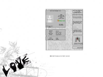
QUOTE(The Markster @ Apr 23 2007, 10:48 PM) [snapback]2540572[/snapback]I like the pictures, dashed brushes, and flower brushes you used for the background image, though I don't think the movie film brush doesn't suit it well. But nice jo

really pretty. i like the vintage background and the brushes you used.

I really like the image and the effect you added to it.On the other hand, the gap between left and right modules kind of bothers me. And what's up with the bar on the left hand side of the background image?

i like it. i think it needs color to it tho, but it's koo. lol

I dont really like the... beveled line(?) in the pattern background, and the film strip is a little eh.But everything else looks nice.

I agree with Mark on the film brush. The layout is pretty, simple and grey which is awesome. Nice layout
Not my favourite Mike piece ever but still recognisably Mike; the brush use is quite mellow this time but it's not bad, it allows the L.O.V.E to stand out - very different and original btw - which is good though I do have some weird double border thin
Add Comment
You must be logged in to comment
Layout Details
| Designer |
IVIike
|
| Submitted on | Apr 24, 2007 |
| Page views | 110495 |
| Favorites | 333 |
| Comments | 21 |
| Reviewer |
StanleyThePanda
|
| Approved on | Jan 1, 1970 |