Bubble (comments)
Displaying 1 - 14 of 14 comments


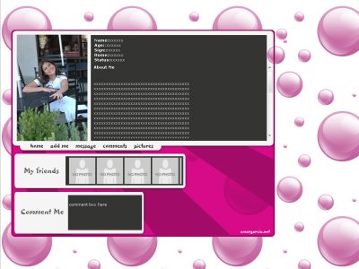
Thanks guy for all the feed back good or bad , i really appreciated I guess beauty is in the eye of the beholder!Well this is what user think of bubble!http://omargarcia.net/joomla/index.php?opt...=view&id=36

....=/I hate to be totally negative about a layout, but I honestly don't like anything about this one at all. It seems like it was slapped together in a few minutes. It doesn't seem to go together, the blank pink space is an eyesore, and the gener

I think it's fine.You guys should brush up on learning code, if you can't put the comment box in.Don't be lazy..I like how simple this is and i think the person did a good job with it.It has it's own style and not like everything on here..
ehhh..the bubbles are just too..bubbly for me and I agree with the fonts..but I do like the hint of spiral for the blog bg

The background is too repetitive for me >_>And I don't like the fonts you chose to do this..

i don't like this at all. The colors don't really seem to match to me and it looks like it was made in like 10 minuites. It is aligned well, and the coding is fairly good but the layout as a whole i really don't care for.

not too fond of this layout... would of looked beter centered, if you choose different fonts, and a different color for the content background instead of the dark grey that u used....the background also looks very odd the layout, something similar like th
Why don't you just put the code for the comment box in?I don't really like this; it's not integrated as a layout, and while it has a theme, it's not executed brilliantly - there's pretty much no creativity with execution. It's very
Add Comment
You must be logged in to comment
Layout Details
| Designer |
OmarGarcia
|
| Submitted on | Apr 23, 2007 |
| Page views | 62808 |
| Favorites | 279 |
| Comments | 14 |
| Reviewer |
StanleyThePanda
|
| Approved on | Dec 31, 1969 |