Reach For The Stars (comments)
Displaying 21 - 35 of 35 comments

I love this one, its so pretty! I just wish the layout was more to the left, there's too much white space.

beautiful i attempted something simaler to this a while back but it didn't turn out right
the fonts are a bit boring >>;;the header is really simple i like it(:the navigation could have been betteroverall its cute.-miku


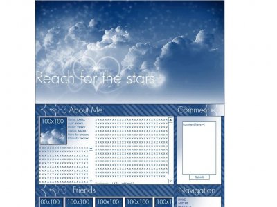
Pretty, pretty, pretty.I can see a lot of people using this =]

Nice.I like the heart and the little shine spots (I don't know what to call it).

I think a colored background would be better, and not just... white.But the image is very pretty. I like it.
hm.. for the header, i thought the lil twinkles made the layout a tad bit low quality. i think all CB layout now have low quality images i think it might just be CB hosting.


Thanks for all the feed back. It wasnt supposed to go down that far Oh yeah, thanks blaqheartedstar, i'll be sure to use that code in my marquee next time

Yeah, I really love the base image too, but I'm not that fond of how you put the title. The 'Century Gothic' font looks perfect on this layout. In my opinion, the blue stripey background for the content area would've looked cooler if they

picture looks awesome, the friends div layer's height is rather large for its intended height on the layout background. the font used for the headers looks lovely and goes well with the layout try adding marquee width="xxxpx" height="10
Add Comment
You must be logged in to comment
Layout Details
| Designer |
IBangBaby
|
| Submitted on | Apr 19, 2007 |
| Page views | 83180 |
| Favorites | 464 |
| Comments | 35 |
| Reviewer |
JimmyCrackCorn
|
| Approved on | Dec 31, 1969 |