Using This Layout
For specific instructions read designer's comments
- 1. Log into myspace.com
- 2. Click on Edit Profile (Profile 1.0)
- 3. Copy (ctrl c) and paste (ctrl v) code to the specified fields
Layout Comments
Showing latest 10 of 11 comments

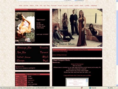
Oh wow. I love this, I even like the pic quality it kind of looks like old parchment which actally makes the layout better..
Anyway. Great job. [:

Classy..Neat..Good job..

i don't like it but its nice i guess.

Love the show.Picture quality is quite horrid.But other than that, the layoutis nice, what with the colors and all.

Very nice. Very happy to see a Buffy layout. The picture quality grew on me, but I didn't really like it at first.

I like the noise texture, though the opacity could've been lowered a bit.The background pattern is overused, but it looks good with the layout, and I like the color of it.

^^ it makes the pic look awesome... doesn't work out... maybe cuz its tooo muchDuchess of Dork - Awwww thanks!!! gotta love snape and the awesome actor playing him Thanks again

QUOTE(Duchess of Dork @ Apr 19 2007, 6:41 AM) [snapback]2535425[/snapback]I'm not sure if you chose a bad quality image or if you intentionally made it look grainy like thatYeah, I did. It has a really noisy texture over it. I don't know,

QUOTE(blaqheartedstar @ Apr 19 2007, 7:38 AM) [snapback]2535424[/snapback]pic quality is really bad....nice colors thoughi agree i also don't really like the way the background looks but thats just me

Pretty. :)I'm not sure if you chose a bad quality image or if you intentionally made it look grainy like that, but I wish it were more clear. Fabulous choice of a photo though. I've always loved that one. Giles The layout is nice. I noticed
Layout Details
| Designer |
LostinaJungle
|
| Submitted on | Apr 17, 2007 |
| Page views | 44,989 |
| Favorites | 56 |
| Comments | 11 |