Livewire -- (DIV) (comments)
Displaying 21 - 40 of 46 comments

does any1 knoe how to make the pics smaller so they can fit in the friends list?
I think it is a good layout I wish it would have been centered. I had to figure that out myself.Does anyone know how to get the comments to show up with this layout?

This is an awesome layout, but I don't like the font on the headers of the sidebar and the blog.
[size=7][font=Arial][i cb]i can not get the images to appear...the default ones wont dissapear!!!hellp meeeim pretty new so you would know how aggravating it is!! lolthanks!!

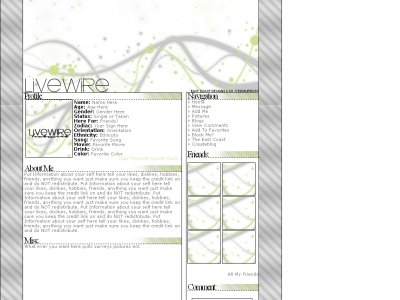
thanks everone QUOTEOh and by the way, did you use a brush for the header, the grey & green section on top?The curvy lines?If you did, do you think you could share? :]i found the site on http://xanga.com/brushes if you want the exact site check the

Oh and by the way, did you use a brush for the header, the grey & green section on top?The curvy lines?If you did, do you think you could share? :]
I love this layout. Ambiguous towards the text.. love the colors and simplicity. Very original. As aforementioned, the stripes shouldn't stop, however, I do like that it is not centered. Gives it more personality that way, I think. Everyone's layo
I actually love the colors and design.It's just that the font..I don't like it.But other than that, it's wonderful.
I like this layout, its simple. I just don't care for the colors.

hey, i love the layout, worked it out fairly nicely. but... i'd like to have a small scroll down "friends-comments" box below the "insert-comment" box and i can't figure it out. It's not letting me. Could you help out? all
i think i already give my criticism for this layout x] no need to say anything anymore. however, is it just me or is that a scroll bar in your content =)
QUOTE(blaqheartedstar @ Apr 18 2007, 11:27 AM) [snapback]2534241[/snapback]um... i can help with the background.... just need to know the original image size... anyway like i said before the content overlaps on the right side of the layout... (u
This is cool. I like the lightness of the colors in this layout.As Mark said, I like the comment box too. :]

um... i can help with the background.... just need to know the original image size... anyway like i said before the content overlaps on the right side of the layout... (u can see it more with the headers) oh yeah the text in who i'd like to meet is sh

Perso, I really like it! Its well organized and that what people are looking for! But I agree that the cutting of the diagonal stripes is not that great! You did a nice job anyways!
Add Comment
You must be logged in to comment