Broken (comments)
Displaying 21 - 27 of 27 comments

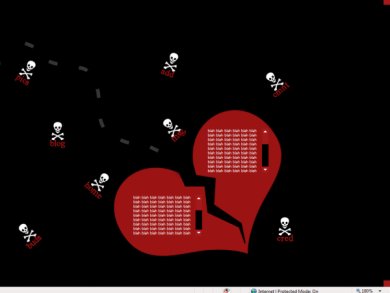
i like the nav.but i think its just a little too messyi like the broken heartRED & BLACK-----cute(:-miku

QUOTE(kissable @ Apr 15 2007, 9:45 PM) [snapback]2531645[/snapback]i dont really like the skull & crossbones, but i overall i love it. i love simple designs. less is definitely more. i liked the other and i love this one as well. i agre


Although it is a little too simple, it look pretty cool. At first I thought the nav was part of the background.
i dont really like the skull & crossbones, but i overall i love it. i love simple designs. less is definitely more. i liked the other and i love this one as well.
A little simple, but it looks nice. It reminds me of a layout i was working on.

It is a bit misaligned for me, I can only see the "g" of the blog, I cant see the "pics" or "buds" link at all.But other than that its pretty neat.
Add Comment
You must be logged in to comment