Converse: Heartbroken Love. (comments)
Displaying 21 - 36 of 36 comments

QUOTE(wentzxxpete @ Apr 15 2007, 4:57 PM) [snapback]2531366[/snapback]Get code for this layout!I love this layout! It's so damn cute!

i like it, if you got a banner, you really shouldn't have a background image.9/10.nice work
i totally adore this =) especially your contact table and the banner =)i think it's just cute =D good job =)
i really like this one. i would use it but im not heartbroken so yeah. lol but i love it. and if i wasnt in search of something that had to do with love and not heartbreak i would have def. used it.
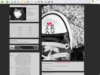
The banner.. the converse shoe, doesn't work.I put the code on my profile three times and each time it didn't show up, everything else shows except thatToo bad, really love this layout

I really adore how you stick to the black&white theme for all of your myspace layouts. Cute and simple.
i dont really like normal layoutsi only use DIVS. i think the network imagehas been seen too many times.the contact table is eh the font is so small-miku


lmfao thanks blaqheartedstar about my hair!yes IVIike you probably have seen this somewhere before.and i know, i know, i know, i know about my contact tableeeeand thank you everyone else for all the lovely comments!


^ Seriously. Reminds me of the good ol' days.This layout is cute, I love the doodle on the shoe. Very junior-high, like flaymzofice said.The contact table made me giggle, the font is sooo tiny! I think you should go with a bigger font for that nex
I don't really like default layouts but there's just something about what you've touched on here that makes me want to steal that shoe. It's just so junior high! The drawing/scribbling on your shoe thing. And I like that it looks actua

heart looks weirdbut man thats a awesome layoutlove the shoe and the message sooooo awesomeoutside of the layout although this is gonna sound kinda gay of me (lol) love ur new default pic, hairs awesome

i can barely read the contact table, but thats nothing new... i like the extended network image but i swear i have seen it before but overall it's a good layout

I love the image its cute with the drawing on them.Though there could've been something more happening if there was background image.I like the layout though, its neat.
Add Comment
You must be logged in to comment
Layout Details
| Designer |
wentzxxpete
|
| Submitted on | Apr 15, 2007 |
| Page views | 182373 |
| Favorites | 646 |
| Comments | 36 |
| Reviewer |
StanleyThePanda
|
| Approved on | Dec 31, 1969 |