City Life (comments)
Displaying 1 - 20 of 23 comments

i like it , but there might be some problems on the comment box , nicely done tho =D

HEYY IF YALL CANT GET STUFF TO WORK YOU DONT KNOW HMTL. IT SAYS "this is a Div Overlay layout, HTML knowledge required!"

how can i get comment box to work and is it possible to enter a code to show my comments?
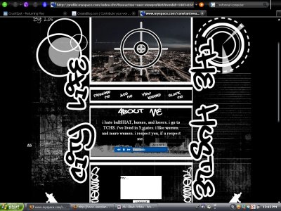
Hey when i click 'view kodaks' it dosnt snd me to the pics how do i get it to work??? Also the "messege me" isnt working either along with the comment box could you plz help me????
wats up with the comment box!?!...nice layout other than that
comment box doesnt work and is there anyway to make the about me box bigger?


QUOTE(sunni! @ Apr 29 2007, 11:33 AM) [snapback]2545221[/snapback]Pretty good start for your first one. Is there a place to view friends on it???i forgot.i dont think so.look at the preview.if not...add one.QUOTE(nandez @ Apr 30 2007,
Pretty good start for your first one. Is there a place to view friends on it???
that's realy nice layout for you'r first time!!i liked it
this layout.was my first layout ever made.thats why so many brushes are used.now...i really never use brushes.but thanx.
I don't think it's that bad though I do agree with Mark that the graffiti font is the best one out there - 08cent (I think that's what it's called) and subway are much better. Also, the graffiti font is over-used. The general (but by no me

Yeah, it does look too busy. The brushes look slapped on without thought, too. To be honest, I'm not really fond of anything on this layout. The graffiti font isn't the one of the best I've seen either. It's okay for a starter, though.

Its a nice start :)Maybe too much brushes, but keep up the good job!
hi los! its about time you found your way to CB...welcome...as far as the layout, i like the grundgy line looking brush used in the background... probably could have made the "city life,the hustle" fonts on the side smaller.
Add Comment
You must be logged in to comment