Heavenly (comments)
Displaying 1 - 15 of 15 comments


i JUST LOVE this one!
even though it has a lot of the same colors, it is still very beutiful..^ ^
keep it up!

i like this layout, but there's no link for a blog... if you could add that somehow i think it would make a big difference! keep it up!!
too much of the same color. you should have used more of the color from the banner. looks bland. i like the less is more concept tho.
if u want to see how much i change it here is my site: http://profile.myspace.com/index.cfm?fusea...ea-da2718574296anyways i love ur layouts!!

QUOTE(elizna @ Apr 16 2007, 7:14 PM) [snapback]2532421[/snapback]He Im sooooooo sorry but i took ur layout and change it a bit. BUT DON"T WORRY I GAVE U ALL THE CREDITS AND IM SORRY I DIDN"T ASK YOU EARLIER. PLEAse i hope u forgive me&
He Im sooooooo sorry but i took ur layout and change it a bit. BUT DON"T WORRY I GAVE U ALL THE CREDITS AND IM SORRY I DIDN"T ASK YOU EARLIER. PLEAse i hope u forgive me!! I truly am with all my heart.[b][size=7]GOMENASAI!!!

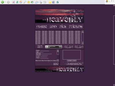
Eh, I don't think the text fits at all. And like someone else said, the "blah blah" on your layouts really ruins it for me. The image is pretty though, all in all the layout is.. okay.
it kinda looks like you wereon a layout streak and lostinspiration here. the brushesare nice(: but why did you titlethe layout twice----heavenlyheavenly----@_@-miku
Okayss. I just ran out of words to put, but I kind of lost intrest in it myself. And the words/brushes, yeah... that I just got lazy, but! now I got feedback I know what to fix
I don't think you should put the "Blah blah" parts in your layouts. That kind of takes away some of their appeal.The colors in this layout are nice, though.

again amanda you have taken the words out of my mouth. yeah i really like the pic but the layout needs a bit of work

font and the brushes ruin the layout... u over did it with the brushes on the top banner and the text is a bit hard to read... its a pretty pic... but not good enough to make a layout out of it

I like it...I think it might have been cool if you incorporated that pink color in the banners into the rest of the layout somehow.
Add Comment
You must be logged in to comment
Layout Details
| Designer |
babyflames
|
| Submitted on | Apr 15, 2007 |
| Page views | 44412 |
| Favorites | 182 |
| Comments | 15 |
| Reviewer |
toyo loco
|
| Approved on | Dec 31, 1969 |