Randomness... (comments)
Displaying 1 - 11 of 11 comments

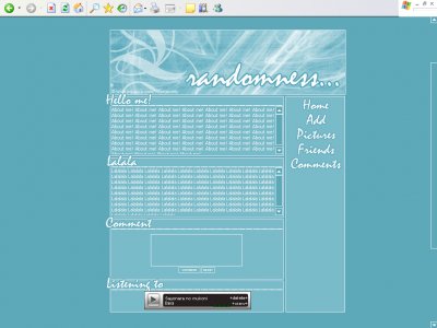
the color is very pretty but only prob i have is maybe u should have made the about me section "expandable", so dat when u put up pics, the box stretches instead of scroll boxes.

I LOVE this one. ^.^ Blue FTW. And the way you made the white lines are beautiful. =3 I'm stunned, and I am using it. ^_^
I like this layout, the set up is nice & I like the brushes you used, but to be random it should have more than one color & diff fonts. The nav should have a few more links too.

^ Agreed, Different fonts wouldve made it more random, which wouldve been neat/cute.But I like it, the colors are nice. Its very simple, but in a good way.
its really boring.i think you should have used morethan one font to make it really randomthe font you used is a default font o__othe brushes you used at the top are all one coloryou could have been more creative with the nav.-miku

QUOTE(Wo0yaPo0ya @ Apr 15 2007, 5:27 PM) [snapback]2531278[/snapback]I think that maybe a scrolling-up marquee for top friends (or just pictures) would be a good use for that space.Ohhh, I should have thought of that. I was brain dead that day th
QUOTE(schizo @ Apr 15 2007, 3:24 PM) [snapback]2531093[/snapback]My only problem is all the empty space under the navigation.I think that maybe a scrolling-up marquee for top friends (or just pictures) would be a good use for that space.

god damn it amanda haha you keep stealing my comments . I hate the font and the color burns my eyes, but i really, really like the set up of it

not really random if its just in one color... not too happy about ur choice of font...

This is my favorite of the ones you just submitted.My only problem is all the empty space under the navigation.
Add Comment
You must be logged in to comment
Layout Details
| Designer |
babyflames

|
| Submitted on | Apr 15, 2007 |
| Page views | 34785 |
| Favorites | 138 |
| Comments | 11 |
| Reviewer |
toyo loco
|
| Approved on | Jan 1, 1970 |