Way Of Life V. III (comments)
Displaying 61 - 80 of 91 comments

I really want to use this arg.. but the backround (PNG) Isn't loading... for me.. >_<; By any chance do you have an alternate link of it? ^__^;Thanks, Thank You.

Nicely done, and very simple. I like it. The darker interface makes it different. Good job.
Yeah, I'll just link to the blog that way. But for the comment section, I have:<center><form method="post" action="http://comments.myspace.com/index.cfm?fuseaction=user.ConfirmComment"><input name="friendID"

QUOTE(elsephen @ Apr 16 2007, 9:32 PM) [snapback]2532672[/snapback]Man, I love this layout and I only have 2 complaints. One you may be able to help me with - I can't seem to get the Comment box to work. When someone tries to leave a comment,
Man, I love this layout and I only have 2 complaints. One you may be able to help me with - I can't seem to get the Comment box to work. When someone tries to leave a comment, it says the user doesn't exist or may have deleted profile.... any idea
oh lmao i was confused at the comment anyway oh well thats good i have a bew one comming very soon QUOTE(drewboo @ Apr 15 2007, 6:48 PM) [snapback]2531507[/snapback]hey what software do you use??adobe photoshop 9.0
Facepalm. I meant to say this isn't my favourite of your layouts. Stupid typos and such a crucial one as well! So basically, throw rotten fruit at me for being stupid, and I guarantee there won't be any thrown your way because I your signatur
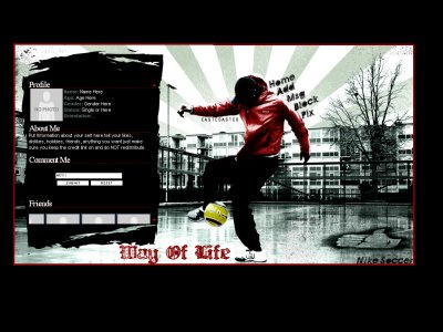
i love it especially the skater and motorbike onei reckon one with a dancer would look cool like this like a breakdancer in it

Oh my goodness, Mike. This is definitely one of your best layouts. I LOVE the colors, the contrast is amazing!Everything looks great.
thanks everyoneQUOTE(flaymzofice @ Apr 15 2007, 4:59 PM) [snapback]2531369[/snapback]Hmmm...don't throw rotten fruit at me, okay? But... this is my favourite of your layouts. It's a departure from your signature style (I was sitting there
Hmmm...don't throw rotten fruit at me, okay? But... this isn't my favourite of your layouts. It's a departure from your signature style (I was sitting there holding down shift going, 'come on you stupid laptop, load the brushes, where are
i like it(:the brush of the about meis really nice && ive always lovedred and black theyre just two colors that go together so well -miku
This is by far my favorite layout ive ever had. The html work was not hard at all. I'm looking forward to seeing more of your creations.
Add Comment
You must be logged in to comment