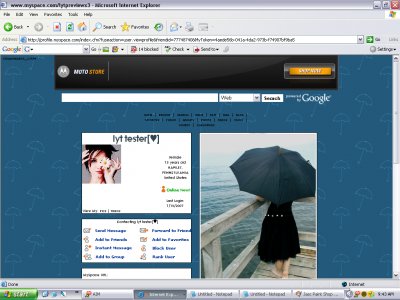
Umbrella By the Sea (comments)
Displaying 1 - 18 of 18 comments

how do i take out the comments section? or at least get it to where it doesn't take up half the page?
much appreciated (i love his layout)
I love this layout, but I'm having problems. First, where do I put the "about me" text? Because, as is, it ends up in the top left-hand corner. And the umbrella image isn't showing, there's just a big white space. :(
I love this layout and want to use it, but the picture in the network area is moved to the far left and there's a big white space on the right side [as if it were a rotated polaroid photo]. I don't have anything that would stretch the tables. Other than this, the layout is perfect. Any suggestions?


i love this clean and simple look! i love the photography and the little umbrellas! plus the html isnt all complicated

Where do i put the "about me" text? mine ends up on the far right side of the screen for some reason...

^ Just take out this part of the code:CODE<style type="text/css"> td.text td.text table table table, td.text td.text table br, td.text td.text table .orangetext15, td.text td.text .red
I love this layout it is awesome!But i was wondering if i could put the top friends back in. And if i can do that, how can i do that?

QUOTE(IVIike @ Apr 15 2007, 1:16 PM) [snapback]2531193[/snapback]LMAO i always feel like that... i agree with everyone i just wish the extended network lined up with the rest of the content... it's just a bit bigger Seriously, dude. The exte

QUOTE(The Markster @ Apr 15 2007, 3:17 PM) [snapback]2531078[/snapback] (ew, here's the word) cute, LMAO i always feel like that... i agree with everyone i just wish the extended network lined up with the rest of the content... it's just

i agree with marklayouts uber cute the extended network pic is lovely and the background is cutenice layout
Wow, the simplicity of this layout looks really attractive. The umbrellas in the background look (ew, here's the word) cute, and the banner image fits in perfectly. You should've made a contact table for it.
The little umbrellas are so cute! This is a very simple, but neat layout.

I agree with schizo I love rain, and I used to have my own signature to do with umbrella (hit people with it LOL) Nice image- LOOOOVE it

Add Comment
You must be logged in to comment
Layout Details
| Designer |
luckylifex
|
| Submitted on | Apr 14, 2007 |
| Page views | 89525 |
| Favorites | 251 |
| Comments | 18 |
| Reviewer |
toyo loco
|
| Approved on | Dec 31, 1969 |