Fly away with me (comments)
Displaying 41 - 50 of 50 comments

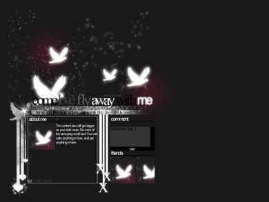
i agree with mike, the layout is pretty... but the navigation is nasty

I like the layout, though I think that the fonts could have been a little bit better.

the bruses are cool and the birds look nice. I hate the navigation... it's just not original at all. The glow effect worked out nicely though

ooh!! This one is so pretty!!! I love the birds!! But I agree that there's a lot of empty space to the bottom, the page just keeps scrolling on... But all in all I think It's a cool layout!


I really really love this layout! The glow of the text and birds is really pretty

I agree with mirukuyu I also feel like I have seen this layout before- probably somwhere else? I like the way the birds been created, but there could've been more done in the spaces that weren't used I don't find it boring, I do find it a
this layout is kinda boring >>;;there is so much unused space towards the bottom. i think you usedthe same brush too many times.i guess its just too plain-miku


Add Comment
You must be logged in to comment
Layout Details
| Designer |
IBangBaby
|
| Submitted on | Apr 14, 2007 |
| Page views | 127507 |
| Favorites | 691 |
| Comments | 50 |
| Reviewer |
JimmyCrackCorn
|
| Approved on | Dec 31, 1969 |