Dots and Crosses (comments)
Displaying 1 - 12 of 12 comments

ok i love this layout!!
but one question.. does any one know how to get there picture to show on the actual page???
other then that i love it :)
can you tell me a way to make the thing stretch instead of a scroll box?

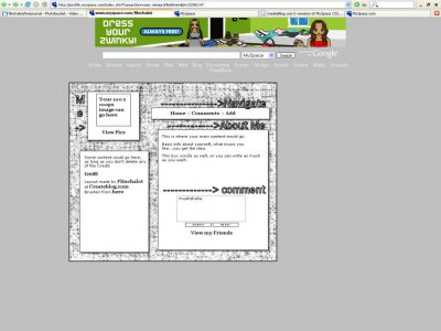
not too happy on ur choice of brushes and font for the headers, and i agree with parts of the profile is showing

QUOTE(IVIike @ Apr 13 2007, 10:04 AM) [snapback]2528787[/snapback]i really like it except the profile is still showing through on the sides I believe its showing through because of the cB preview, and it may not actually show through on myspace.

I like this.My only problem is the positioning.It would be better centered.
This is pretty cool. The navigation is too minimal for my taste, but simplicity is good.

The background's ok, I would suggest working on the headers because IMO I think they look a little odd where you put them. Especially the "me>" one . Otherwise its ok. :]

you forgot to add the "block me" link in there somewhere. and, in firefox, its not centered.and since you already have a navigation box; it probably would have been better to hide the top navigation, but that's just me.but i realllllly do
When I saw the screenshot I was like, no way, I'm not gonna like this but then I clicked on it and actually, I really do. It's really neat and clean and straight forward though agree with Mike, the default profile still shows though. And I don'

i really like it except the profile is still showing through on the sides
Add Comment
You must be logged in to comment
Layout Details
| Designer |
flinchalot
|
| Submitted on | Apr 12, 2007 |
| Page views | 52000 |
| Favorites | 109 |
| Comments | 12 |
| Reviewer |
StanleyThePanda
|
| Approved on | Dec 31, 1969 |