Circles (comments)
Displaying 1 - 16 of 16 comments

Love this. The colours and cirlces are so cool, and quite 'clean' too. =D +faves!
i copied the code...but for some reason, it isn't allowing me to view pics...it says invalid user...what could be the problem

Very nice, I really enjoy the creative use of brushes.

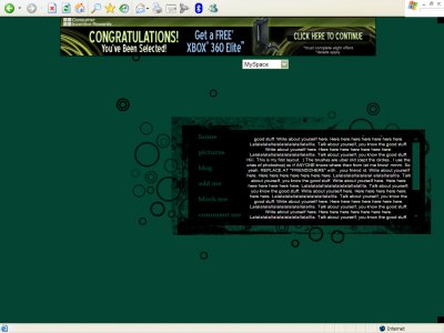
I love it It's so simple but well effective! Nice layout

QUOTE(flaymzofice @ Apr 12 2007, 1:04 PM) [snapback]2527786[/snapback]Kind of reminds me of fainaru's work but not as sophisticated. What was the effect you were trying to achieve? I like the abstract concept that seems to be behind it but...

jeezzzzz.why is it that everytime i try to make a graphic or something with those little circles grouped together, it always looks like there are too many in one spot, or it just looks wierd. but when anyone else does it, it looks fine. lol.is that just m

i agree... too dark... but people like that anyway the layouts cute just don't like how flushed it is to the right of the page... but for some odd reason can't seem to see it centered or to the left....nice for ur first layout here

I like it, I think it came out very well. You blended everything in together and the color is nice. Nice job dear.

QUOTE(Lock&Load @ Apr 12 2007, 2:57 PM) [snapback]2528059[/snapback]Wow, thanks people. Didn't think people would like it too much.. Nav font edited.Nice. It looks a lot better now. In my opinion, heh.

Wow, thanks people. Didn't think people would like it too much.. QUOTEYeah, it really does remind me of him. _smile.gifI think the nav would look better if it stayed all caps, like it does on hover. This is a nice layout for people who like simple,

....I actually like this one a lot.I'm considering using it for my personal.Good job.
I agree with everyone.. reminds me of fainaru's workBut, very good for your first!
QUOTE(flaymzofice @ Apr 12 2007, 10:04 AM) [snapback]2527786[/snapback]Kind of reminds me of fainaru's work but not as sophisticated. What was the effect you were trying to achieve? I like the abstract concept that seems to be behind it but..
Kind of reminds me of fainaru's work but not as sophisticated. What was the effect you were trying to achieve? I like the abstract concept that seems to be behind it but...I'm not a fan of simple layouts. Not a bad job though.
Add Comment
You must be logged in to comment