She (comments)
Displaying 1 - 13 of 13 comments

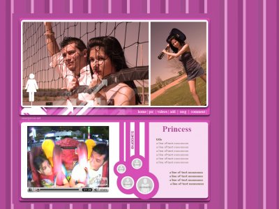
this is really cute.i love the different size pics for friends, its creative.enough, not too much.

Glad you guys liked it! The friends section was my girlfriends idea...thanks nessa!

i love the friends sectoin, but i don't like the pattern in the background

I like how it all flows together. The youtube video is funny. The friends part is really unique. I've never seen anything like that on here before.


I actually don't like this one too much...For the friends section, do you have to cut your friends pics to fit in those circles?I didn't check the code so I don't know.But if you do...a lot of people are going to have a hard time.
i like this layoutthe pictures are unique(:&& quite predictable i wouldsay this but very creativefreinds section-miku (i like love purple >>;;)


Love the retro-ness :DAnd the friend's space is lovely.Great job.
I like the whole retro thing and the color really fits everything

QUOTE(flaymzofice @ Apr 7 2007, 2:21 PM) [snapback]2522073[/snapback]The friends' section is awesome; very innovative and I like the purple a lot; I really like the background; it's catchy without being overbearing. I wish there were more
The friends' section is awesome; very innovative and I like the purple a lot; I really like the background; it's catchy without being overbearing. I wish there were more content space however, and the arrow brushes seem a bit out of place with the
Add Comment
You must be logged in to comment
Layout Details
| Designer |
OmarGarcia
|
| Submitted on | Apr 7, 2007 |
| Page views | 45006 |
| Favorites | 71 |
| Comments | 13 |
| Reviewer |
OmarGarcia.net
|
| Approved on | Dec 31, 1969 |