Edward Scissorhands (comments)
Displaying 21 - 31 of 31 comments

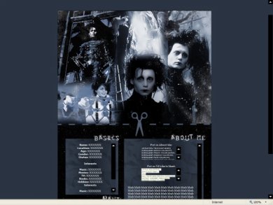
ok so i love the background for the content. it works really well with the rest of the layout. great job

Ooh. I had a layout quite similar to this awhile ago for Blogger. I love using those colors when it comes to Edward Scissorhands. I'm not sure if I like the font, though. I like the dashed line thing, but I don't like how the module and blog are s

the layout is bomb but that dude gives me the creeps he might be hiding under my bed at night lol but good job *high fives you?*

Thank you everyone. Everyone always hates my navigation :( I don't like extravagant navigation...it takes away from the neatness and the banner.


oohh I love this movie! And you did a great job with the font and the blog bg is really good.the cut and the sissors is a really creative idea although it tends to 'pop' out a little more than the rest of the layout
this is the exact same setup as your NMBC layout.and i agree^ you should change the navigationbut still i like this -miku

This one's pretty nice. I like its neatness, though I think you should pimp up the nav font a bit.

cute layout although i don't like the huge scissors in the middle
Oh My Gosh! Oh My Gosh! I love you, I'm in love with/obsessed with Johnny Depp!!!! Ahhhh thank you so much! Yay! =DDD
Add Comment
You must be logged in to comment