Don't Panic (Div) (comments)
Displaying 1 - 18 of 18 comments

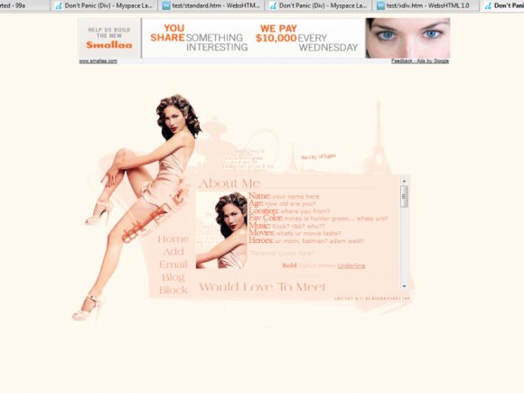
very sexual and very lightly colored for a Jennifer Lopez Layout.
I would rather have a warmer color thats not so much the color of
her natural skin tone to even out the layout but other than that
it is a very very very very very very very very very very very
stinkin
layout
Thats beautiful
hey.. wow i gotta admit i really love this layout and i am a big fan of your profiles... so by any chance can you do a similar format but with marilyn monroe on it...
I love this! The colour scheme is so girly and pretty. And like everyone else has said it makes such a change from other dark layouts!And i love the navigation

i love the animation, it's amazing.... and the rollovers give it the "x factor" great job

I love this.I don't like jennifer lopez....But the layout's nice.

flaymzofice - thanks alot!! the font is called American ClassicStanleyThePanda - i said it before and i'm gonna say it again... i f**cking love ur icon, as for the buildings yeah those brushes are amazing, gotta thank 37pence for them

This is very neat, I love the colors. The background with the buildings/tower/ferris wheel = amazing touch.And I like the roll-overs too. Nice job, dear.
LOL I'm starting to get to the point where I look at your layouts just to see what crazy new thing you've done with the navigation; loving the creativity there and this one is no different. At first, I thought the blinking 'city of lights'
O Amazing - panit shop pro's animation programhixfive - Thanks mzkandi - thanks
awww..this is so pretty and light I love the little brushes you added to make the layout spark

i love love love the animation, but i think its just a bit too "light" (maybe its just me)anyways question: how did you make the animation? I have photoshop CS but i don't know how to anime
mirukuyu - yeah a change was needed, was gonna make it a link hover... but at the last min made it into a animated imagetoyo loco - thanks thats means alot coming for youThe Markster - i added the animation last min, but thanks glad u like it k33zy - firs
i love this its so light and bright....rathar that always seeing dark layouts.!!! i like the nav font switch also.

Tis teh sex! Oh wow, the header's even a GIF image. I didn't notice that. =]

i am such a fanboy of your work :Domg your layouts are so goodi actually really like the style and the headder imge.a gif? genius-miku
Add Comment
You must be logged in to comment
Layout Details
| Designer |
Blaqheartedstar
|
| Submitted on | Apr 5, 2007 |
| Page views | 29120 |
| Favorites | 43 |
| Comments | 18 |
| Reviewer |
blaqheartedstar
|
| Approved on | Dec 31, 1969 |