Kelis-Milkshake (comments)
Displaying 1 - 19 of 19 comments

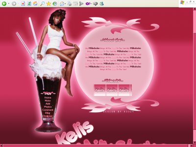
No 'this' is beautiful'. There's a beautiful woman sitting on top of a delicious chocolate sundae, and then the menu is inside the sundae. Original- I have't seen another layout exactly like this.

if i were to have seen this layout a long time ago
i would have used it
its very well done. and very colorful

hi could u make a chris brown layout the same color of this one thanks:-}
THis MyspacE Layout is THe bOmB.. Even THoh thE song tHat InspiRec thE baCkgrOUnd Is Old I love tHe layOut. Keep Up THe GooD woRk.. alwayS...NAyNAy F BabiiE.
Hey k33zy I was wonderin can u make a DIV Layout of the R&B Girl Group Cherish

good i like it its just that it is pink :( i like her and that song is off the chain but i just like how everything is eye catchin
The song is really old. And i have to say, so is the graphic work. But nice concept and you executed really well! keep it up.

I like the milkshake thing and i like how you blended the colrors

I agree that the Times New Roman for the navigation links aren't good&&The background of the whole thing looks a bit odd..?
QUOTE(blaqheartedstar @ Apr 3 2007, 12:56 PM) [snapback]2516687[/snapback]omg shes on a huge shake... scarythe song is funny, old but still goodnice layout the glow effect worked out well on just about everything the cut out looks pixled but i gu

omg shes on a huge shake... scarythe song is funny, old but still goodnice layout the glow effect worked out well on just about everything the cut out looks pixled but i guess its ur first time?
Ah, I hate pink but I really like this layout; it's food pink which is not only acceptable but lively. I like the image, goes so well with the colour and I like the fade pink glow around it. I'm not crazy about the font, but I definitely think you

it's quite an old song but i love how you did this layout everything looks really great
Add Comment
You must be logged in to comment