Green Leave (DIV) (comments)
Displaying 1 - 20 of 23 comments


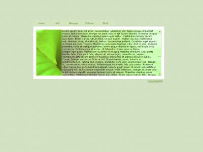
this layout is so perfect.
its simple, and clear.
not cluttered or confusing
perfect [=


A lot of people are saying that this layout is too simple, but when I found it, it's exactly what I was looking for, something crisp, simple and nice. Thank you for making this layout. =]
Cool layout but the music player shows through and covers the text area.-Xain

I like it. I just wish that you would've put a comment link on the nav bar. Btw, the nav is unique I like it. I love the green in it, it's a good simple layout next time just try to make them a bit bigger.

QUOTE(anime.essence @ Apr 1 2007, 9:45 PM) [snapback]2514977[/snapback]I agree with this design being very simple. The leaf, to me, seems to be a bit blurry and low quality. I first thought it was the skin of a fat caterpillar or something. i w

I love that it is simple. We barely have any simple layouts that actually look good. Simple is better sometimes.
Haha - the skin of a 'fat' caterpillar specifically Ricky?Pretty much what everyone else has said; the hover on the navigation is the best touch. I think you could get away with this layout if you did something, anything, brush work etc to the ima

Now this is what I'm talking about, especially since it reminds me of spring. :P Love the simplicity. A litte bit of text peeks out from underneath the image but I hope that's just the preview. Navigation is cute.

I agree with this design being very simple. The leaf, to me, seems to be a bit blurry and low quality. I first thought it was the skin of a fat caterpillar or something.

QUOTE(IVIike @ Apr 1 2007, 2:48 PM) [snapback]2514292[/snapback]it's ok... i'm not jumping out of my chair or anything. lmfao, anyway its simple... too simple but the hoverlinks are a lovely touch i like green though, um... some content a

QUOTE(IVIike @ Apr 1 2007, 1:48 PM) [snapback]2514292[/snapback]it's ok... i'm not jumping out of my chair or anything. I like the color and the set up of it but i'm not crazy about the navigation. Everything is aligned nicely. In c
hey mark!! (sorry off topic)i wanted to add one more thing... a bit of the default profile is showing through it will go away if the user clears their about me but if they don't it might still show through so next time when you're designin

I love how simple it is. The form is different from any other layout I've seen.:D

I agree with Mike. It's not so outstanding, but it's nice and simple, especially the nav.

Add Comment
You must be logged in to comment