Creation of Beauty (comments)
Displaying 21 - 39 of 39 comments

^ Yeah sure. My image program actually does that for me... so all I do is draw where I want the link, and it gives me the coordinates. What image program do you use?

beautifully done!!! oh hey racheal! it's racheal right? my name is kim and i was wondering if you could help me with on how to use image map coords i think that's what it's called. reply back!!!!!!

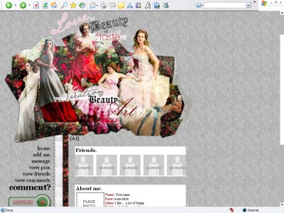
Lovely image work.Although I'm not so fond of the patterned background you used.

The font actually "doesn't change sizes." It's kind of an optical illusion - I just stacked the links in a pyramid according to length, and then increased the size of the last one.

its not flashy just simple in a good waythe change of font size
QUOTE(IVIike @ Mar 30 2007, 2:25 PM) [snapback]2511387[/snapback]the nav is really creative And Amanda made a comment about it too but I can't see anything different about it than what other people have so, am I missing something??

the nav is really creative and i like what you did with the header image like i said you get more amazing everytime

The layout looks really good. I like the way you did the collage with it. It looks good but I don't like all different fonts. I guess it looks weird for me.
the white background doesn't show up, but everything else works finelove the header and merge of imagesalthough u work well with fonts it seems a bit too much on the header taking away from the image it selfi like this new style and ur navigation
im in love with this, if i liked div overlays i would use it! im old school on myspace lol
^I'll fix it as soon as my FireFox browser is working properly Um... I think the secret lies in choosing an off-white border color to make it blend in more with the gray. Also font choice is pretty important too. I was trying to get a kind of "
In FF, you can't see the size of the content areas so I was going to suggest a border or something just to delineate this but from your preview I see you have got a system in operation but just need to fix it for FF. I love the rough cuts around the D
this is really pretty.. funny that i had planned on using her in a layout. but i love this.
This is absolutely beautiful I love what you did with the photos of Drew and the divider
This is really nice. I love the quotes you put on the banner; they're true. The navigation's increasing text size is nice too.
Add Comment
You must be logged in to comment
Layout Details
| Designer |
digital.fragrance
|
| Submitted on | Mar 29, 2007 |
| Page views | 71632 |
| Favorites | 253 |
| Comments | 39 |
| Reviewer |
digital.fragrance
|
| Approved on | Dec 31, 1969 |