Step Up! (comments)
Displaying 1 - 16 of 16 comments


omggg, i love this layoutt. and channing tatum is soo hott. O_O amazing job.


quick question ummm well where it says image 100x100 how do u put a pic there????
can you please make one for the movie Love and Basketball

yeah i agree with everyone the layout is ok but nothing really amazing

well i really love the organization and placement of the contents

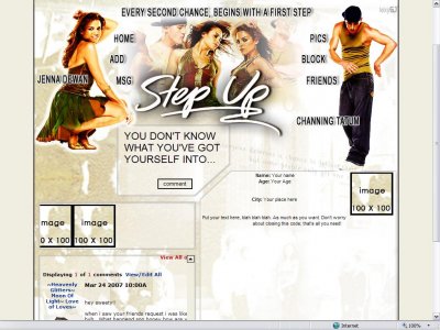
Part of Channing Tatum's arm is erased And I think you used overlay/soft light (if you use photoshop) a little too much for the image because they're skin looks orange. Other then that, the setup is nice.
Hey guys,well thanks for the comments and suggestions. Yeah the font doesn't really fits in there... well i'll work on that detail the next time. It's not Arial, but don't remember the name of the font i used, to be true...well.......

I agree with the people above.It looks okay. I liked the movie which I also made a layout with too. For some reason, it just feels like you just took 3 images and put them together & nothing else w/ tech boxes. You should try to spice it up with some

like the content set up... but not ur choice of fonts... navigation is really bad... just seems to be placed there with no concept of how the font ruins the layout as a whole...same with that quote on topthe size of the text on the comment box is far too
Yeah, it just looks like giant Arial.The layout's pretty cool though.
ehh.. the font used for the header (not step up) is a little boring..but the bg is great
Add Comment
You must be logged in to comment
Layout Details
| Designer |
lexygjal
|
| Submitted on | Mar 29, 2007 |
| Page views | 34918 |
| Favorites | 79 |
| Comments | 16 |
| Reviewer |
whimsical0dreamz
|
| Approved on | Jan 1, 1970 |