The Pumpkin King (comments)
Displaying 21 - 34 of 34 comments


QUOTE(flaymzofice @ Mar 30 2007, 7:17 AM) [snapback]2511436[/snapback]^ Not in FirefoxYeah, the links are blue in Firefox.Other than that this is a cute layout. You're a really good blender.

QUOTE(Ralph501 @ Mar 29 2007, 10:12 PM) [snapback]2511007[/snapback]The layout looks really good and so does the banner. There is one flaw, the colors of the links. Doesn't match with the layout at all. >.<The color of the links is the

The layout looks really good and so does the banner. There is one flaw, the colors of the links. Doesn't match with the layout at all. >.<

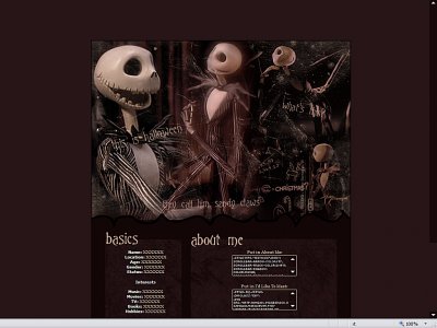
Neat set up, simple and straight forward. I like the graphic work, cool blending - am not familiar with the pumpkin king (sorry if this is major bad) but it looks cute (and not as scary as I first thought it might be). Only complaint is the colour of the

^ Please post this in Myspace Requests. Also, you need 50 posts before requesting anything.

QUOTE(IVIike @ Mar 29 2007, 9:26 AM) [snapback]2510231[/snapback]toya kind of read my mind i love the header and the color is really cooli agreewas just gonna comment about that and bam... beat me too it... u did pretty well with the movie st

toya kind od read my mind i love the header and the color is really cool

I have to say this has to be a really good one for you. I like the fact that you are actually incorporating the colors of the layout into the header. It looks like you used some brushes/texture and you blended that in well. I also like that you went a lit
Add Comment
You must be logged in to comment