Spiderman 3 (comments)
Displaying 1 - 12 of 12 comments


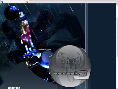
I love this layout, Im def gonna use it. I just wish his head wasnt cut off on that 3rd image of him lol.

Is it just my resolution or is this layout a bit huge? lol I wish there was more contrast between the background and the Spiderman figures because my eyes just wander around and I don't see a 'focus'. Overall, though, well done. You too, Mark&
QUOTE(flaymzofice @ Mar 29 2007, 8:51 PM) [snapback]2510904[/snapback]When I first saw the title I thought it was the other Spiderman layout being re-submitted following alteration then I saw that it was by Trancie and positively rubbed my hands

The heading is so creative and awesome. Took me awhile to notice there was 2 pictures, and I thought it was 1 but cut in half. I was wrong. lol. I think it looks funny with spiderman body w/ no head. lol. The orbs look kind of random & odd but it'
When I first saw the title I thought it was the other Spiderman layout being re-submitted following alteration then I saw that it was by Trancie and positively rubbed my hands with glee in anticipation of what was in store. There is no doubt you set the s

lol well like always you make awesome headers odd style thats only you

i agree the navigation is too big for me but the header is pretty amazing
crazy effect, been staring at the 2nd spiderman... can't seem to find his face although he looks turned... its the one in the middleanyway i like the layout but the font of the navigation is a bit weird..
its amazingit would have been cooler if u had a spiderly txt u know?
Add Comment
You must be logged in to comment