Designer's Comments
Look carefully for specific instructions
***please DO NOT remove my credit link
***please DO comment on this layout (I am trying to design something for the male CB users) You can also message me and give me ideas for other male CB layouts..
Using This Layout
For specific instructions read designer's comments
- This is a div overlay layout, html knowledge required!
- 1. Log into myspace.com
- 2. Click on Edit Profile (Profile 1.0)
- 3. Copy (ctrl c) and paste (ctrl v) code to the specified fields
Layout Comments
Showing latest 10 of 15 comments

THE GAME IS MA FAMILY!!!!

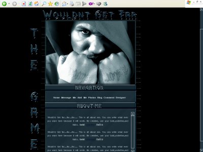
this is perfect. everything is great. i love the game, and that picture is rad. 5 stars!
sorry for the comment.but can do normal layout?NO DIV
hey do you think you could make a chris brown one ill really love it

QUOTE(blaqheartedstar @ Mar 26 2007, 9:13 PM) [snapback]2507837[/snapback]overrall... its okdon't like the artist though...i agree i like the color though

Eh.I think its a little too much blue.Maybe thats just for my taste.Yes, the beveled font is...not so appealing.The overall text...is sort of an eyesore.
QUOTE(blaqheartedstar @ Mar 27 2007, 5:04 PM) [snapback]2508490[/snapback]i just noticed u had this "Vrinda" in your codesu mean VERDANA?never heard of a font called virndayou probably are right. i spelled it how it was spelled when it

i just noticed u had this "Vrinda" in your codesu mean VERDANA?never heard of a font called virnda
I really like the image choice and the effects you've used on the header but I don't like the fonts or the bevel. I also think it's a bit blocky? Like, this is followed by this, then this and this and it's very cascading with the presentat
cant say i like him, or the beveled effects. plus, no need for the NAVIGATION title, im sure people can figure that out. but overall a nice layout.