Designer's Comments
Look carefully for specific instructions
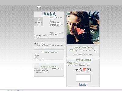
NATALIE PORTMAN LAYOUT
remember, the less you put, the more simple and easier it looks on the eyes.
anything with "hidden" in the code means that it was enabled to hide friends, contacts, contact table and comments. if you want to enable them (which i don't recommend because it will skew the dimensions of the layout) just put "visible".
remember to credit as always :D and anything in caps means that you need to change it.
Using This Layout
For specific instructions read designer's comments
- 1. Log into myspace.com
- 2. Click on Edit Profile (Profile 1.0)
- 3. Copy (ctrl c) and paste (ctrl v) code to the specified fields
Layout Comments
Showing latest 5 of 5 comments

I love the header imagebutI agree that it is a little dull
By synthase on Mar 24, 2007 6:06 pm

^Agreed.You could've added another color to make it more interesting/appealing to the eyes.
By cowsarecool on Mar 24, 2007 5:40 pm

A little boring....maybe less grey?
By schizo on Mar 24, 2007 1:41 pm

i like the extended network banner although the placement of the heart is rather weird...
By Blaqheartedstar on Mar 24, 2007 10:25 am

it's alright not really anything really special that jumps out at me
By IVIike on Mar 24, 2007 10:04 am