symbols (comments)
Displaying 1 - 17 of 17 comments


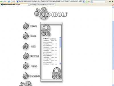
^^-From dictionary.com-because no one uses real dictionaries nowadays1. something used for or regarded as representing something else; a material object representing something, often something immaterial; emblem, token, or sign. I don't really know i

^Yea I actually agree with this comment.I guess I'm just not to intrigued by this layout. The whole swirls are a little pixely around the edges also, just a bit weird. I don't really get the point of the symbols because most of the time don't
Its not the best.It could improve.Keep working at it and I know you can make better layouts


i love it. it immediately caught my eye.i'm quite fond of simplistic designs. its very neat,not too much going on & crisp. less is definitely more.kudos. i think i'll use it. if only i could codei'd be able to code my own designs

i really like this layout very tech and modern i like the way you set up the navigation... the only thing i don't like is the scroll bar it stands out too much but other then that it's good


I think the theme gives a little demotion, but I do like the shades of grey you used as well as the vector graphics. I don't really like 'busy' stuff either, but the theme could use a little more enhancement.
well in making it, i was shooting for the plain look because not everyone like busy layouts. but thanks for your opinions.
What Amanda said. Too simple, not really much of a concept except symbols and then there aren't that many of them. You didn't try to jazz up the navigation either.

yes, I agree with Mark. This layout is okay, maybe you should add a little sometime to it like other brushes or somethingFor some reason, Im not too fond of the font you used

agree... it was like no thought other then what brush i'm going to use went into this layout... had it been more then one brush then yeah i'm pretty sure this would of come out better

Hmm. The layout is aright.I'm not fond of the simplicity of it, though, as well as of the bevel effect.
Add Comment
You must be logged in to comment
Layout Details
| Designer |
k33zy
|
| Submitted on | Mar 20, 2007 |
| Page views | 57234 |
| Favorites | 120 |
| Comments | 17 |
| Reviewer |
a beautiful nothing
|
| Approved on | Dec 31, 1969 |