Way Of Life V. II (comments)
Displaying 1 - 20 of 25 comments

http://s199.photobucket.com/al bums/aa173/TroyFTB2/?action=vi ew¤t=untitled-1.jpg
Everyone go here http://s199.photobucket.com/al bums/aa173/TroyFTB2/?action=vi ew¤t=untitled-1.jpg
Tha t's what I made out of this layout.

this is an awesome bkgroud! just one suggestion wld b please cld u add a link to blogs?? i know enuff about coding to work out where place stuff but havent quite got the no how to add that in?

Ouch. This is what happens when you take a break from the net - you almost miss to comment on Mike's layout ROFL.Sweet job on this. The brushes go well with the theme. Kudos!

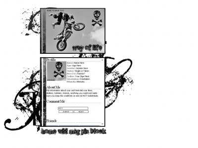
I think the font was a great choice, but i'm not so crazy about the skulls. It seems you were combining two themes into one, but all n all it looks nice.
I love the background of it and the use of the motorcycle is pretty cool to

flaymzofice- urg it took me forever to get the scroll box off i thought i had it lol but thank you the brushes were really light and i had to keep going over them thats why they are blurry holly- well i intended for it to have color but i couln't ge

I wish there was some color in this, I don't really like the brushes you choose but at least the person you made it for likes it..

i really like it but it is really dark and seems really sad
You have a knack for choosing the images that perfectly embody the concept of your layout so well done for that. The font is very well used but I'm not sure the brushes are so great; they look a little low quality, like you've used them at a highe
thanks everyone... i downloaded that font like 3 months ago and couldn't find a good way to use it either until i started this layout JakJak313 - i'm glad you like it. Thanks for the idea
Add Comment
You must be logged in to comment