Head vs. Heart (comments)
Displaying 21 - 30 of 30 comments

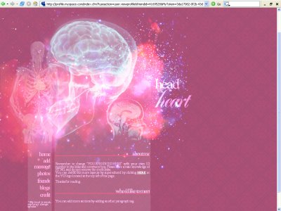
hm well i intentionally made the skeleton sort of faint and look closer, you'll find the heart and yes, it sort of is a pink overload. hah. oh wellthanks for your input guys

Whoa, very very amazing. I especially love the nav, very creative... but I can't find the heart.

Although the whole skeleton is sort of bad quality...the layout is really good :DLove the rollovers.

Very neat, it really makes me think of a graphic Uronacid made and it was sewing a heart and a brain together. Looks neat, I think some of the colors are a bit to bright but everything looks nice.

Great graphic work, impressive blending and...brush work? Like Amanda said, very weird but still cool. I think you need to increase the line spacing for the comment box.
yes, weird but awesomeI really like the colors you used especially

weird, but awesome, love the patterns, and the images used for this layoutgood to see you posted another one
Add Comment
You must be logged in to comment
Layout Details
| Designer |
superednerd
|
| Submitted on | Mar 18, 2007 |
| Page views | 73972 |
| Favorites | 289 |
| Comments | 30 |
| Reviewer |
Azarel
|
| Approved on | Dec 31, 1969 |