iTunes V.2 (comments)
Displaying 41 - 44 of 44 comments

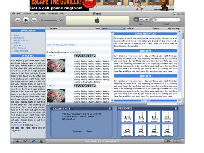
ooh. Definitely good job! A lot better than your last one. But I always seem to confuse the actual scrollbar to the itunes scrollbar in these layouts ;\ I'm clicking it trying to make it move but it wont! Then i realize thats not the scro

Yes. I can't disagree with the above. It's very neat, and I especially like the profesionally added Friends and Comments box at the bottom of the iTunes window. The idea is getting kind of cliche, but your style is really organized. Good job.

Must agree with Holly, a lot of the other ones out there are so sloppy and ugly. I really like it! Keep up the great work!!!

A million times better than the other ones floating around Looks great, and the content looks great as well.
Add Comment
You must be logged in to comment
Layout Details
| Designer |
Relentless
|
| Submitted on | Mar 16, 2007 |
| Page views | 114814 |
| Favorites | 444 |
| Comments | 44 |
| Reviewer |
Ralph501
|
| Approved on | Dec 31, 1969 |