Let's Fly Away (comments)
Displaying 21 - 33 of 33 comments

^ lol now my layouts falls under girly... but i haven't bumped into a dude using my more neutral layouts

QUOTE(The Markster @ Mar 14 2007, 5:59 PM) [snapback]2492849[/snapback]You didn't criticize it. You complimented it. x]that is IMPOSSIBLE!QUOTE(The Markster @ Mar 14 2007, 6:30 PM) [snapback]2492873[/snapback]I KNOW. I need to st

QUOTE(joza2794 @ Mar 14 2007, 4:17 PM) [snapback]2492860[/snapback] ps. this is alwayspogi_2794@yahoo.comanother masterpiece by the pinoy =]great that you added comments to it!!!!i really like it =]you hsould make more of these bu
ps. this is alwayspogi_2794@yahoo.comanother masterpiece by the pinoy =]great that you added comments to it!!!!i really like it =]you hsould make more of these but for guys :D
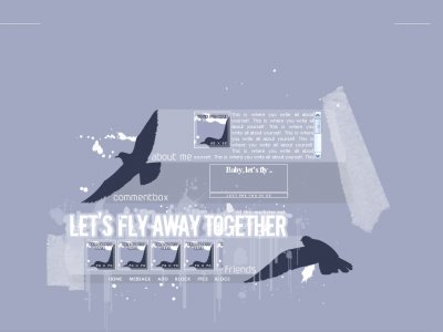
Thanks for all the feedback, guys. QUOTE^Agreed.The setup is nice too =DI just find it kind of odd how theres a line that sort of divides the main part with the brushes and the Friend/Comment Space.Thanks. Actually now that I think about it, I agree that
IVIike, the links work fine for me are they off or don't work??
"baby, let's fly" HAHAHAHAHAHA!!! anytime mark xD LOLi have no comment on this layout because i already criticize it on aim LOL.

very impressive the only thing is your map is off it workd up to "block" and then nothing it's pretty good otherwise. I'm guessing you wanted the friends and comments showing at the bottom since they do and threy match but if you didn&#
Such a great set up and excellent brush use. The choice of colours for each element is well thought out. I just love how this layout looks so good and is also really concise - you haven't got content boxes/images sprawled everywhere. Great job.
wow this is awesome, love the colors and brushesset up is awesomethe only thing i don't like is that huge white thing thats on the right side... again, amazing layout

^Agreed.The setup is nice too =DI just find it kind of odd how theres a line that sort of divides the main part with the brushes and the Friend/Comment Space.


Add Comment
You must be logged in to comment