monsters under my bed (comments)
Displaying 41 - 48 of 48 comments

Hmm... see what you mean, ill change the background now. About me is small because i didn't want to wreck the image. call it a minimalist's layout. Ill fix the grammar too.

About me is kind of small and there is a lot of extra space. Its not bad though. Plus I like the navigation.
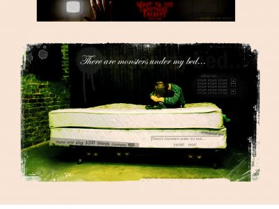
Incorrect grammar. There ARE monsters under my bed not there is (there's=there is) monsters under my bed.Killjoy. I've fixed it. } Azarel

i like it but the content (about me) is far tooo small... and people like to fill it up with all sorts of pics... nice layout though

everyohne pretty much summed it up great main image and idea but the background is a bit of an eyesore

I agree. It looks really nice, but you could've added more. The layout really shows your creativity, though.
It's great but really plain. It would be great if you could add some brushes with psp or ps.

I wish there was some other colors set as the background other than white. It just looks like dead space. The image is nice though and I like the positioning of the links. I think it would have been nice if there was a bigger content area though.
Add Comment
You must be logged in to comment
Layout Details
| Designer |
Dwdrums1111
|
| Submitted on | Mar 12, 2007 |
| Page views | 123144 |
| Favorites | 408 |
| Comments | 48 |
| Reviewer |
Dwdrums1111
|
| Approved on | Dec 31, 1969 |