monsters under my bed (comments)
Displaying 21 - 40 of 48 comments

The easiest thing I do to find all the xxxxxxx's is go in to the codes section, press Crtl + F and type in xxxxxxx and it should automatically find them :)

hey i was wondering if you could make me a layouti want it like this one but could you put "there are monsters under my bed. will you save me from them" ?if you could that'd be great
i love this layout but it wont work for me on myspace 'can you please help me
i rreally like this layout i wish i could figure out how to use it lol. but you have good tastes
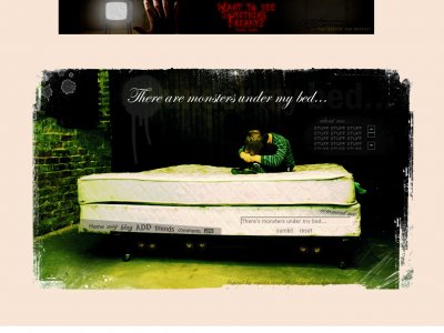
QUOTE(eccentric @ Mar 12 2007, 10:22 PM) [snapback]2490722[/snapback]Incorrect grammar. There ARE monsters under my bed not there is (there's=there is) monsters under my bed.Haha. Great first post...I really like it, but like what other peopl
it's a nice graphic and i like the fonts for the navigation. Wish the content section wasn't so small, but other then that looks good.
Replace all the XXXXX with your friend id.... your friend id can be found in the adress bar when you veiw your profile
I love this layout! I have a question, where do u put your friend id, i cant find the xxxxxxs any where. I am not very familiar with html and codes, but i know soome. If someone could let me know, thatd be amazing.


yeah.. its a layout for people who like only a small and to the point amount of text. this is pretty much because i didnt want to take away from the picture. This is a new thing for me. my layouts are usually all vecotr and using fresh colours. this was j
Lol i actually like the theme =) very nice. the only thing that bother me is the about me part. it's SOOO freakin small. you might want to make it bigger next time

This one is better than the other, but still not great.

thats creative :p and i really like it. The about me is a too small though

You have a knack for picking out really striking images, and I like the border effect you used.But as others have said, I think the About Me needs to be larger. ;)
All is updated... i couldn't change the background colour much, but i think it helps to break up the empty space. fixed the grammar.

I really like it the image you used, and how simple it is. Nice layout.
Add Comment
You must be logged in to comment
Layout Details
| Designer |
Dwdrums1111
|
| Submitted on | Mar 12, 2007 |
| Page views | 123144 |
| Favorites | 408 |
| Comments | 48 |
| Reviewer |
Dwdrums1111
|
| Approved on | Dec 31, 1969 |