Censored! (comments)
Displaying 21 - 31 of 31 comments

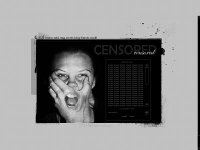
^ yes you are right, the image is very striking and boldthough i think the mouth is kinda scary but nice job on everything else
Its plain because the image is so striking. im sure you could have figured that out.


Hahaha this is a really bold layout.I like it...although it's not something I would use (obviously, since I like bright colors)Mainly what I like about it is the image. I LOVE freaky things like that.Just to let you know, you spelt "Submit"
I wouldn't use this either... but i liked the image, makes a bold statement. It appealed to me, i just liked the pic. Not for how nice it looks but for the statement it makes

QUOTE(flaymzofice @ Mar 12 2007, 7:25 PM) [snapback]2490326[/snapback]Hmmm, nice set up, very clean but I don't like it; the image kind of freaks me out to be honest!i was just going to say that it looks like he is eating trough his hand

^ i agree... the edges are pretty cool, like the message but i don't see myself using this layout... kinda weird seeing that everytime i got to my page
Hmmm, nice set up, very clean but I don't like it; the image kind of freaks me out to be honest!


Personally, I don't really like this one at all It just doesn't make any sense to me, and I don't really like the image. Also I wish it would have faded it out as well as it does on the left side then on the right side were it isn't so gr
Add Comment
You must be logged in to comment
Layout Details
| Designer |
Dwdrums1111
|
| Submitted on | Mar 12, 2007 |
| Page views | 57222 |
| Favorites | 165 |
| Comments | 31 |
| Reviewer |
Dwdrums1111
|
| Approved on | Dec 31, 1969 |