Jeffree Star (comments)
Displaying 1 - 20 of 20 comments


yea the coding just seems so confusing.i get totally lost doing these thingsi guess i'll try one sometime.

^ you work very well with brushes... its just the coding ur stuck with?
i have no idea how to make div layoutsthere too confusing and i have no creativity whatsoever.

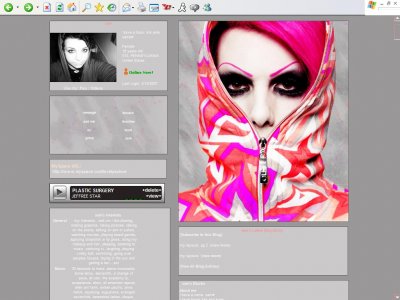
QUOTE(flaymzofice @ Mar 11 2007, 9:23 PM) [snapback]2489551[/snapback]Great contrast and clash of colours; like the shocking shade of pink to emphasise that even more. Very mellow but aesthetically pleasing shades of grey.agreed nice extended net

Oii. I don't like the gray. I like the background/texture on the boxes, but why isn't it in anything other than the link box and the banner?

I really like the way the image pops out so starkly with all the gray, but I agree with the other person about the text.It's so easy to lose it in the background.Other than that, awesome layout!

I LOVE JEFFREE STARRi love how he stands out in all the grey *Favorites*

Great contrast and clash of colours; like the shocking shade of pink to emphasise that even more. Very mellow but aesthetically pleasing shades of grey.
I like how the gray makes him pop out, but there should be more color.Maybe change the text to a pink or something.
love this layout and i agree he does stand outedit:love the text brush u got on the extended network banner 'f**k'crazy

Add Comment
You must be logged in to comment
Layout Details
| Designer |
wentzxxpete
|
| Submitted on | Mar 11, 2007 |
| Page views | 39301 |
| Favorites | 59 |
| Comments | 20 |
| Reviewer |
Intercourse.
|
| Approved on | Dec 31, 1969 |