Perception (comments)
Displaying 1 - 14 of 14 comments

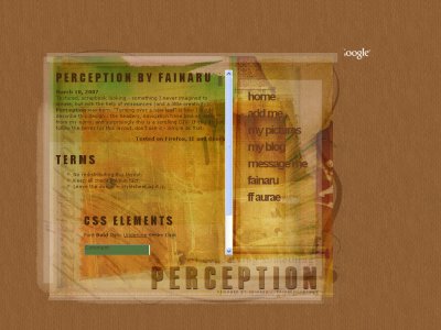
I really like this layout...these colors are my favs and the texture is fitting! It almost has an old world feeling as well as a 'torn pages" look.I like different and your layouts stand out and are soo not the norm...Just what i like!Yet

Well oddly enough I never noticed this layout until just now. I think it looks alright, I think more of a creativity spin could have been pulled off instead of getting a texture and doing very minor editing. The navigation is nice although the backgrounds

QUOTE(flaymzofice @ Mar 11 2007, 8:37 PM) [snapback]2489575[/snapback]Ah, hybrid genesis, figured I recognised that texture. You haven't done that much to it but as your first foray outside of your regular creative style, it's not bad; HG
Ah, hybrid genesis, figured I recognised that texture. You haven't done that much to it but as your first foray outside of your regular creative style, it's not bad; HG textures don't usually require much more development anyways they're s
^ Wow, you use Netscape? Haha, I thought it'd be ancient by now +} heh heh. But that's cool, delivering to the masses eh?

i use netscape... and it doesn't pick up the colors of the scroll bar... but i make them cuz tons of people like that stuff, lol
@ Amanda: Yeah, the pattern was a default from PS and I thought it would 'add' to more er ah, excitement to the layout heh heh. Yep yep! I'm glad you like it <3@ Mike: ROFL. The scrollbar is default cause I use firefox and it doesn'

Daaang, Fainaru. You set up a new standard for your layouts. I'm impressed.

love the colors and the navigation i would have liked it better if the scroll bar wasn't so "default" but other then that it's amazing
This is pretty cool. I like the green parts in the background; they go with the brown nicely.
love the texture, colors and the hover links look awesomethis is new compare to your other myspace layoutsalthough the pattern looks a tad odd, but goes with the texture
Add Comment
You must be logged in to comment