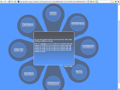
Designer's Comments
Look carefully for specific instructions
I made this one simple and different. I hope you like.
Best fits 1024x768 resolution
Using This Layout
For specific instructions read designer's comments
- This is a div overlay layout, html knowledge required!
- 1. Log into myspace.com
- 2. Click on Edit Profile (Profile 1.0)
- 3. Copy (ctrl c) and paste (ctrl v) code to the specified fields
Layout Comments
Showing latest 10 of 11 comments

I disagree that others that there is something tacky about this layout. I think the layout is brilliant. It's the FONT that's brining it down, and the white and brown shadows behind. But I really admire this layout, though. xoxo

i like the layout but why isn't it allowing me to view my pics...it says invalid user.
QUOTE(mona lisa @ Mar 9 2007, 10:18 PM) [snapback]2487163[/snapback]Perhaps since it was saved as a jpg? Since the image doesn't have many colors, saving it as a gif or png would've been better for such graphics. About it appearing clear

Perhaps since it was saved as a jpg? Since the image doesn't have many colors, saving it as a gif or png would've been better for such graphics. About it appearing clear on your screen and not on others, it may be due to the type of monitor (the o
that was something i actually have a question about. how things appear clear on my screen but not as clear on others. would any of you have an idea of why that would be?

^-- i agree the font looks really compressed to me you know like you resized it or something

very weird layout... not something i thought i'll see here on CBthe font effects doesn't seem to go much with the layout as a whole
If anything, I think the font is tacky. I expected a more hi-tech-looking font before previewing the layout. Love the simplicity and design, though! I think the colors are fine. :)
yeah i was a bit iffy on the colors too. i was experimenting.

I agree, i guess its the colors. Its too blue. But the design is original